Thursday 17 February 2011

GD: Carpathian Dusk

I`m actually finishing packing up, and should be going to bed now as we`re setting off for the airport around 5 am;/
But because this wrap is the last project before my short break in Poland, I want to show it too.
It is a 3 colour gradation on a linen Moss, which was dyed to some very exact specifications of one American mama. Among other inspirations, she mentioned Romanian mountains, which still belong to the wildest and most beautiful places in Europe. Having some very far Romanian ancestors myself, I fell for it completely.

For dusky purple I`ve used mostly Claret with the small addition of Plum Blossom and grey.
The wrap has been approved by the owner, and by my Nina as well!:)


Something about photography before I leave....

Because I treat what I do seriously and want everyone who uses my services to be happy with the result, I`ve decided to write a few words about photographing wraps and concerns regarding this issue.

I`ve received notions that my wraps look even better in real life than on the photographs (which is great news), but there have been several recently with the reverse notion, that they`re less saturated/the colour is less rich than on photographs (which is not such great news).

I take my photographs indoors, in a quite dark home, and at this time of year, in incredibly dark environmental circumstances. I use a DSLR (digital Single Lens Reflection) semi-profesional camera. Because of the darkness, I use also a bit of additional light. I do not tweak the photographs afterwards, except for some usual "tidying" like cropping, rotating and evening the light levels, or sometimes, when they`re too dark, adjusting the exposure.

Now let me explain to you how a SLR camera works (and that is also a case of a digital one).
When taking a photograph with a SLR, user sees the image exactly as it is, without it being "altered" by any inside components of the camera. The quality of the image is then very good, as there is no (or almost no) noise to spoil it, which is the case with non SLR cameras. In simple compact cameras, the image goes through the 'wires" inside the device and is generated then (and spoiled) by its` components. The end result image is therefore flattened and full of noise, which makes the colours fade and depth of image is practically non existent.
With a SLR however, the image that a photographer sees, is reflected by a series of mirrors. Technically, mirror picks up the light and sends it through the condenser lens to the 5-sided prism (pentaprism) and then to the user's eye. When the photographer takes the picture the mirror swings upwards to let the light coming through the lens to be sent straight to the image sensor. This means the image is of better quality and ALSO shows the true colours of a photographed feature even though for the naked eye in bleak light it may not seem so.
I am not a professional photographer and I am not attempting to give you any supertechnical explanation, because in heart I think how photography works might be the work of little fairies sitting inside a camera rather than laws of physics and so on.

Of course, there`s always a question of having a properly calibrated computer monitor (which I admit, is my problem and I`m working on it-and I know from my IT friend that about 90% users have it done wrong).

So to those of you who are wondering how true the colours are on these photographs: they are pretty true, but be aware that very often human eye cannot pick them up as the camera sees themm(which is all due to the lighting conditions mostly). This is very often a case of especially the reds, purples and pinks (colours extremely hard to photograph) and certain greens. Be prepared that when you receive the wrap the colours you`ll see might be lighter/less saturated than on pictures, and this is a general rule, not only with my wraps.

I am not surprised when I see a wrap on FSOT or any babywearing forum (dyed by any of the dyeing artists, or even not dyed but weaved with coloured threads), which appears awfully faded compared to what I`ve seen on the dyer`s or manufacturer`s page, or in real life. I know the picture`s been taken with mostly a commercial digital compact camera or even with a mobile phone, and this tells me all.

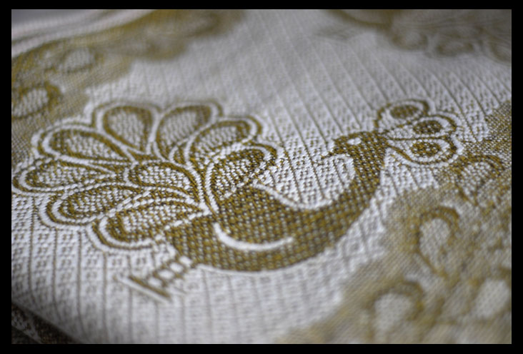
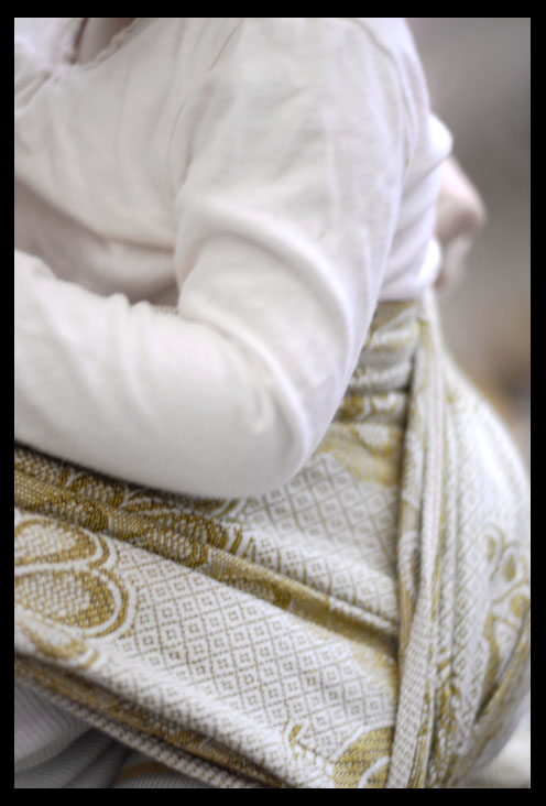
As an example of how these things work, have a look at these photographs of Zara Pearl.
First two are indoors, with sligltly different ligh conditions (one in summer, one in winter):


an the same wrap with others:


and here`s Pearl photographed with a compact digital camera in Auto settings, in full (well, almost) sun in summertime:


But to make things less confusing, I am working on a new photography setup now,which I`ll be using from my next projects. Feel free to email me your thoughts about this issue if you feel you can add something to it or if you feel I`ve said something not right.

Also, part II of this topic will appear soon, when I`ve finally received a very controversial wrap which has caused all that stir.

Tuesday 15 February 2011

GD: Zara Seaside Serenade

A lovely lady in the US is expecting a little girl to be born soon, so she decided to have a gradation done on a Natur Zara for this wrap to be the baby`s own.
She told me what colours she was thinking about, and what she didn`t like, and together we worked on what would be the best for this project ...
That`s how this 3 - colour gradation was created, and I truly hope it will bring a lot of joy!


Monday 14 February 2011

GD: Twins

Well...not identical, but very similar!
I have just finished another sea-themed grad, and while it`s still on the set-up, waiting to be washed, I`d like to present you two unlikely sisters: an Indio Aquamarine and a Storchenwiege`s Leo which I decided to name a Peacock`s Feather, according to the owner`s inspiration.

First goes an Indio shorty, which flew from France and is going to fly back there tomorrow (well, today actually). I just love the way this pattern took the dye, so it is still very much visible yet nicely underlined by subtle watery shade.


Then there`s Leo Natty turned Peacock`s Feather. Grey is also featuring, but the other half is more jade and teal green.
At this point I must admit that I find Leos most difficult do dye!Strange, I know.
Anyway, this baby is flying to Poland, where hopefully will cheer up one young mama!


Thursday 10 February 2011

GD: Ocean Casablanca

I have a dear friend who lives in Paris. She asked me to dye a wrap for her friend there, who was expecting her first baby in February. Joanna bought a new Hoppediz Casablanca and sent it to me, as she decided this would be her baby shower gift for the new mom, who wants to babywear (and that`s always good news, isn`t it?)
She told me that the expecting mother had blue eyes and loved blue colours. Her son was supposed to be born under the sign of Pieces. And the mom`s name is...Delphine.
So, could this wrap be dyed any other colours...?
I`ve used Turquoise, Carribbean Blue, Teal and Azure blue to create this oceanic gradation. I hope little Raphael will have many cosy snuggles in it!
Oh yes-he decided to come to this world a month before his scheduled date:)
So a little Ocean for a little Aquarius and his mom Delphine...


Gold Pfau formerly known as Garnet:)

So I got myself one of the latest Didymos releases, the 50% linen Pfau, in a way sort of a birthday present. My birthday is not until the 22nd, but I doubt they`ll release something special then, so this birdie has to do it.
But I wasn`t very keen on the partiotic red colour. Of course it`s better for us than the pinkish Carmin Fische, but still...
I decided to let it swim with some TD in the washer. And like Phoenix from the flames, my P(h)au came out of the water all nice and gold -white.
Much happier with it now!


And with its` black and white brothers:


And I just wanted to add a few words after reading here and there that it is spoiling a perfectly pretty wrap. Well; it is mine and I prefer bolder/calmer colours with elaborate patterns like here. The crazy red wasn`t good for us, and as much as I liked it (on other people or on a shelf;), I am intending to use this wrap, so it had to work for us colour-wise as well...
So, the genuine colours purists, please don`t look;)

Wednesday 9 February 2011

GD: Tropical Fish

This gradation has been done for one mama who wanted a cheerful but tasteful colour combination. She chose orange to turquoise and that`s how her hemp indio has been transformed.
All she needs now is a black babywearing bag or scarf to compliment the colours of the wrap-and the search for a tiny fish named Nemo can be started!
Well, I really like all the sea themed circumstances, so I`m happy to help:)


Tuesday 8 February 2011

GD: Zara Orchid

I did this gradation on a new Zara White some time ago, and then almost forgot about it while being busy with custom orders. Today I`ve taken it out of the drawer and photographed along foth the fishies in post below:)
Did I ever mention that I loved dyeing Zaras?
Because I do. And I think this pattern is just created to be dyed.
This one is no exception and I am very pleased with the result.

Colours used: Imperial Purple with a tiny bit of Chocolate Brown to deepen the colour, Fuchsia Red and Raspberry.


and Nina was actually happy when we wrapped in it:


...but this beauty is on the way to Australia now!

GD: (Carmin) Sunburnt Fish

The name comes from the owner of this lovely wrap; the fishies in question refused to change colour, agreeing only to swim in a differently coloured waters:)
Yes, if any of you ever wondered what the famous CF would look dyed without stripping,here`s your answer.
I`ve used Amethyst and some purple mix dyes along with Jet Black with a minimal amount of Charcoal Grey.
As can be seen, this wrap, althought not one of double-faced linens, behaves exactly like one. The linen thread however has appeared resistent to dyeing efforts!
But the effect in my opinion, albeit unexpected, is quite extraordinary.


Saturday 5 February 2011

GD: Taffy a la Neapolitana

I`ve been wondering what these famous American sweets taste like, since one American mama asked me for a grad that would remind her of those. She wanted it in the classic Neapolitan colours, only softer, more subtle. Just like the sweets she remembered from her childhood.
So I did my best not to make the colours as vivid I was tempted!;)


And I am still thinking about the saltwater taffy taste!

Wednesday 2 February 2011

GD: Su Hua Hemp

Imagine dark blue deep sea, becoming turquoisy light as it comes closer to the shore. Imagine sea foam, washing on the grey beach. Imagine this beach stopping almost on a high cliff, covered with green forest. Imagine this and you`ll see this beautiful place called Su Hua in Taiwan.


(image from: http://exploreislandsnow.com/category/pacific-volcanoes/western-pacific/taiwan/)

One mama wanted this place reflected on her wrap; she also sent me her graphic project of that, so I tried to create something in between the picture and the mock-up.
After a long battle for the proper hunter`s green (and waiting for the missing dye to arrive), Su Hua hemp is finally ready:


Tuesday 1 February 2011

I am in love

...and have to share:


GD: 2 wraps for 2 New Year`s promotion winners

So I have finally managed to finish the two winning wraps in my New Year`s lottery.
Two lovely mamas who paired up to win will be soon reunited with their transformed wraps. Both chose the green palette, one sent me a very specified project while the other left the colour decision with me (except for one rail:)

First goes Mojito for Jacquelyn. The wrap that has been sent to me is BBSlen Turkish Delight (I didn`t know those were so wide and long!). One rail was to be dyed a lemony lime green, which included the "window panel" area.
For the rest, I used my mixture of greens to create this slightly bluish/minty shade. Altogether, a full glass of delicious Mojito has been prepared along with a finishing slice of cold lime:)
(Strangely, when I presented this to Jacquelyn, she said she had used to make the best mojito drinks!This was just meant to be!)


Alisa also chose the greens, but she sent me her own project for this gradation. She wanted it to look like a tulip just before blooming, with shades of green coming from the darkest emerald to almost translucent yellowish avocado, finished with a natural, peachy rail. It wasn`t an easy task, as the first colour layer rinsed out in the wash-yes, that`s 100% linens for me!
Nevertheless, with a slightly adjusted approach, I put the colours on again, and this time they stayed. And they stayed nice and fresh:)
That`s how this lovely Tulip Bud was brought to life!